
- Client:Bank client
- Categories:Branding, UI/UX
Overview
This project focused on the redesign of an internal enterprise presentation tool used for creating and managing slide decks in a high-demand professional environment.
The existing system had evolved over time, resulting in a complex and fragmented interface that reduced efficiency for power users.
The objective of the redesign was to improve usability, streamline workflows, and support faster content creation without reducing functionality.
Role & Responsibilities
As the lead designer, I owned the end-to-end UX and UI design process, including:
- UX audit and usability analysis of the existing system
- Competitive benchmarking across leading productivity and presentation tools
- Facilitation of user feedback sessions with internal power users
- Definition of new information architecture and interaction structure
- UI redesign and workflow optimisation for core user tasks
I worked closely with product and engineering stakeholders to ensure design decisions were aligned with technical constraints and user needs.
Problem Statement
Over time, the existing interface had become increasingly difficult to navigate due to incremental feature additions without a cohesive structure.
Key issues identified included:
- Core functions were buried within a dense and overloaded toolbar
- Lack of logical grouping between related tools
- High cognitive load caused by excessive visible options
- Inefficient workflows for repetitive presentation-building tasks
- Poor alignment between interface structure and actual user behaviour
As a result, users experienced slower task completion and reduced efficiency when building presentations.
Research & Discovery
To understand the problem space, I conducted a mixed-method analysis combining:
Competitive Benchmarking
Reviewed leading presentation and productivity tools to identify:
- Common interaction patterns in slide creation workflows
- Approaches to tool organisation and progressive disclosure
- Strategies for supporting high-frequency user actions
Internal System Audit
Analysed the existing product to identify:
- Feature usage patterns
- Workflow friction points
- Interface density and hierarchy issues
User Feedback Sessions
Engaged with internal power users to validate assumptions and gather qualitative insights around:
- Daily usage behaviour
- Repetitive tasks and shortcuts
- Pain points in navigation and tool discovery
Key Insights
The research revealed several consistent patterns:
- A small subset of tools accounted for the majority of usage, yet were not surfaced prominently
- The ribbon-based interface lacked clear grouping and created unnecessary cognitive load
- Users relied heavily on repetitive workflows that required multiple unnecessary steps
- Feature placement did not reflect real-world task sequences
- The system architecture had not scaled effectively with feature expansion
These insights highlighted the need for a more structured, workflow-led information architecture.
Design Approach
The redesign strategy focused on reducing complexity through structure rather than removing functionality.
Key principles included:
- Workflow-Based Grouping
Reorganised tools based on actual user tasks rather than feature type, aligning the interface with natural usage patterns. - Progressive Disclosure
Reduced upfront visual complexity by limiting the number of exposed tools, while maintaining full feature access through structured grouping. - Hierarchy-Driven Interface
Redefined visual hierarchy to prioritise frequently used actions and improve scan-ability. - Efficiency Optimisation
Streamlined repetitive workflows by reducing interaction steps for high-frequency tasks.
Solution
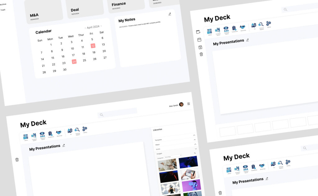
The final design introduced a simplified and structured interface that improved clarity and efficiency for users.
Key improvements included:
- A restructured tool architecture based on user workflows rather than feature categories
- A cleaner ribbon interface with reduced visual noise and improved focus
- Enhanced accessibility of frequently used functions through clearer hierarchy
- Consolidation and regrouping of related tools for faster discovery
- Support for repetitive tasks through improved interaction efficiency
The redesign created a more focused working environment that better aligned with how users actually build presentations in practice.
Outcome
The redesigned interface improved usability by reducing unnecessary complexity and aligning the tool structure with real user workflows.
It enabled a more efficient content creation process for power users by reducing friction in core presentation-building tasks.